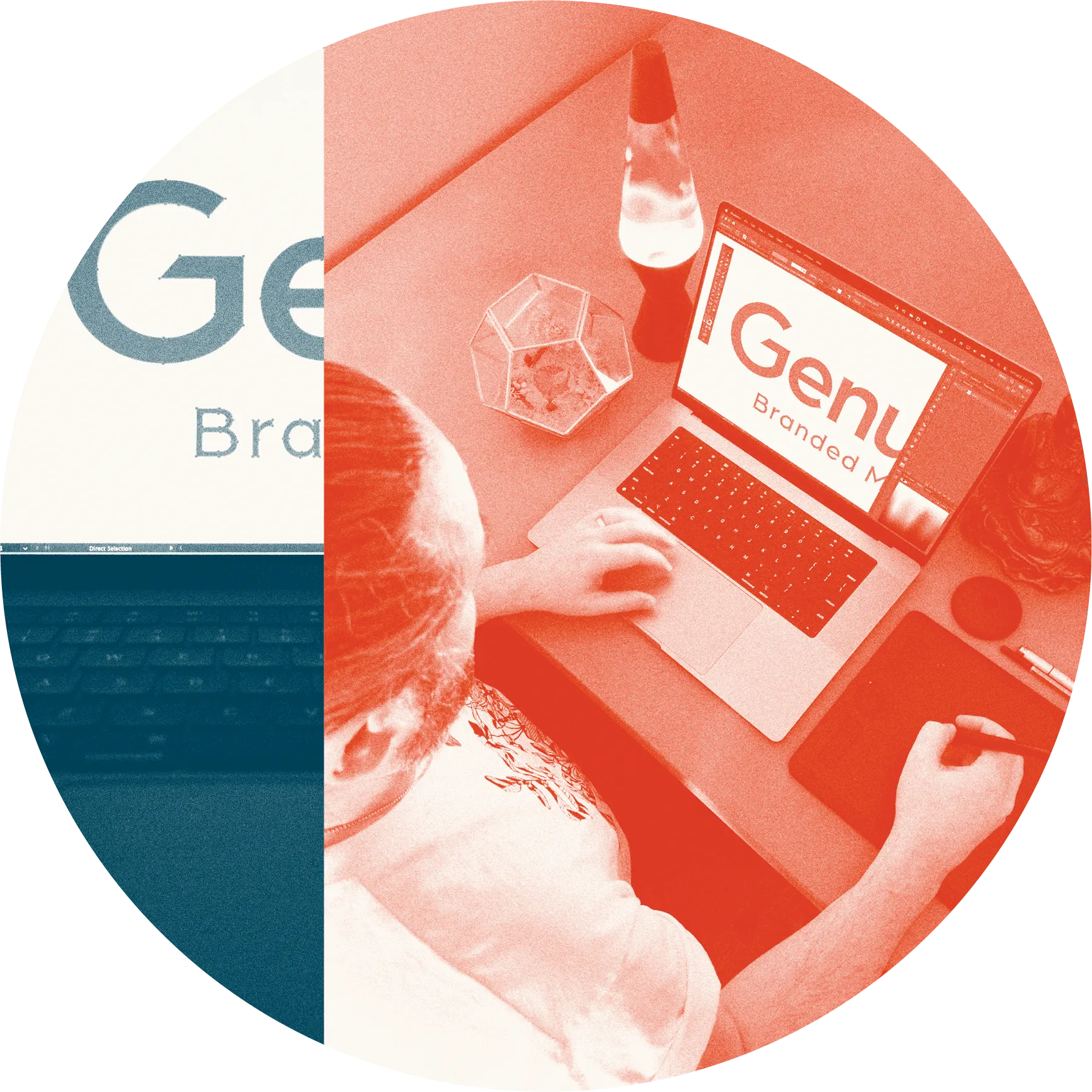
Helping tell stories is what we do for a living, an ethos woven into every fabric of our company. So, when it was time to refresh Genumark’s branding, we knew that it had the opportunity to be more impactful than simply being a makeover of our logo; It was a chance to bring a whole new feel to our brand that really got to the heart of who we are.
Spurred on by a number of important changes in recent years, including naming Mitch Freed as CEO, becoming a Certified B Corp, expanding into the United States, and integrating the Rightsleeve brand into our own, this reimagining of Genumark was a true team effort. Here, we chat with the crew who brought this bold vision to life – Creative Director Marc Newberry, EVP of Sales and Marketing Stephen Musgrave, and Marketing Manager Jasmin Bollman.
A splash of nature in our brand.
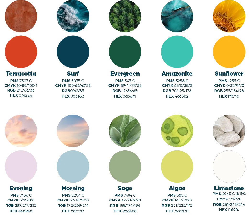
We decided it was time to bring our core values front and center. Inspired by our commitment to sustainability, we’ve infused our new branding with the colours of nature. “We wanted the overall feel of the brand to be more welcoming and relatable, while still conveying the expertise we’re known for,” explained Stephen. Our new colour palette is all drawn from nature. Complementary colours with a broad enough range to come together in unexpected ways. They keep our brand looking fresh, unique, and full of life.
 Teamwork makes the dream work.
This wasn’t a solo mission. While Stephen and Marc led the charge on the vibe and the visuals, Jasmin was tasked with modernizing the voice of the brand. “I had been slowly integrating Genumark’s new voice over the course of 2023 into everything we did, especially with our social media posts,” explained Jasmin. “I wanted clients to get used to hearing us speak in a new way online that we hadn’t been before, but that they definitely experienced in person when chatting with our team. My goal is to bring that authentic, real-world conversation feeling to our online presence.”

For his part, since becoming CEO in 2022, Mitch has helped to imbue the values of Genumark into this rebranding. “Being a family-owned company that has the ability to provide world-class service while still maintaining the personal touch we are known for– I wanted all of that to be conveyed by simply looking at our new branding,” said Mitch. A tall order, but one the team tackled together. “The big ‘aha’ moment came when we shared our new logo with Mitch, [Executive Chairman] Mark Freed, and the rest of the team,” said Marc. “It’s hard to please everyone, so having everyone get excited as soon as they saw it was a monumental moment.”
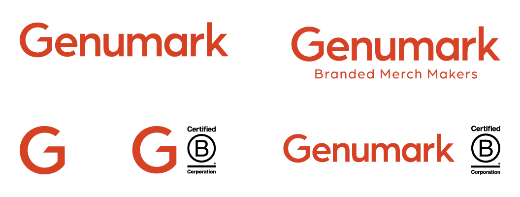
That excitement came from a whole new feel for our wordmark. We moved away from the angular all caps we had been using and embraced a more friendly sentence case that is smoother, rounder, and much more conversational. “We wanted the font to feel fresh, but also timeless,” explained Stephen. “It had to be something that wouldn’t become dated a year from now.” Being font–lovers, there were different iterations of the wordmark the team was considering – some more experimental than others. While they weren’t chosen, they were fun to create. Here’s just a few of the options the team considered:
“For the wordmark, I didn’t just want to use a font right out the box,” explained Marc. “For the ‘G’ in Genumark, I balanced the lines to reflect the ‘k’ at the end and adjusted the height of the ‘k’ to give balance to the overall logo.” Arboria Medium was selected as our main font, with Arboria Black being used for headlines. “This will create brand consistency across everything we do, while using combinations of our colours will keep everything fun and fresh,” said Marc.
Working as a team also meant creating room for play. The logo, designs, and colours that were chosen went through a number of iterations. “We wanted to have room to explore all of our ideas, even if we knew some of them wouldn’t work,” says Stephen. “Giving people space to play creatively is where the good stuff comes from.”
The final logo design.
The heart of rebranding.
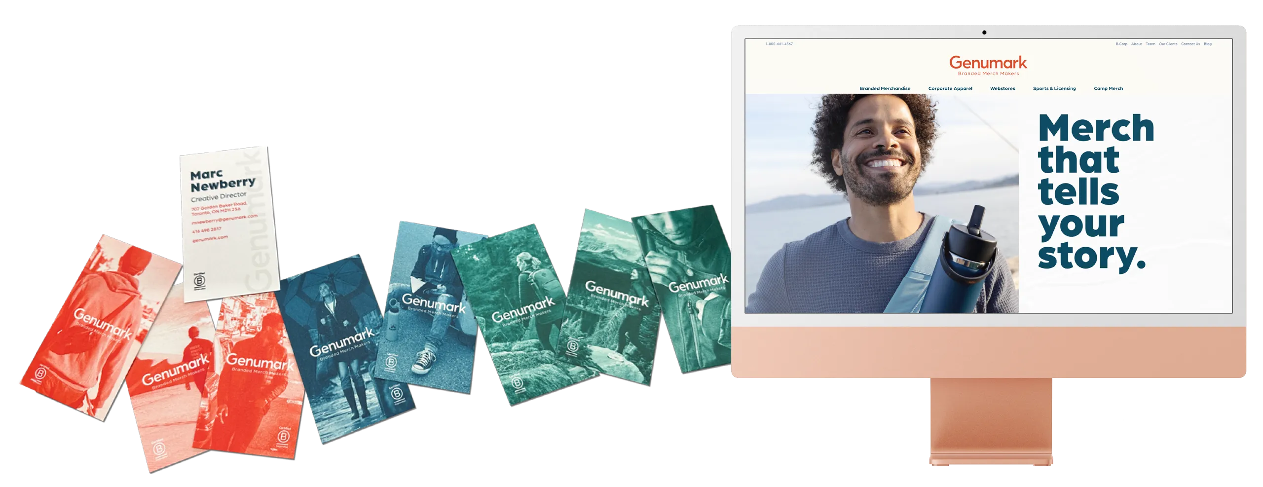
Our new look is more than just a logo and colour scheme. It’s about feeling connected to what we stand for. “Your branding is your logo, but your brand is how people feel when they see it,” as Stephen puts it. “We want to make sure when you see Genumark, you see a reflection of our values and mission.”
We’re in the business of making an impact, not just selling things. “We are thinking about every aspect of the merch we create for clients: Where should the imagery go? What colours should be used? What size should the imagery be?” That’s the type of thought that went into this rebranding, too. Our shift to using action-filled, lifestyle images is all about telling those stories and making every piece of merch meaningful.
What’s next?
As we step into this new chapter, we’re not just changing our look – we’re evolving our story. We’re here to make a difference, and our new branding is just the beginning.
We know that what we really do is help companies tell their stories, not just put their logo on things. We are here to make sure people feel your brand.